Improved Filter Visibility Increased Conversions

Client: Pinnacle Promotions

Hypothesis

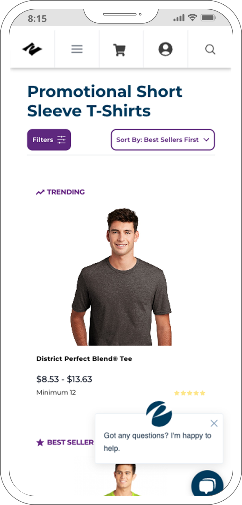
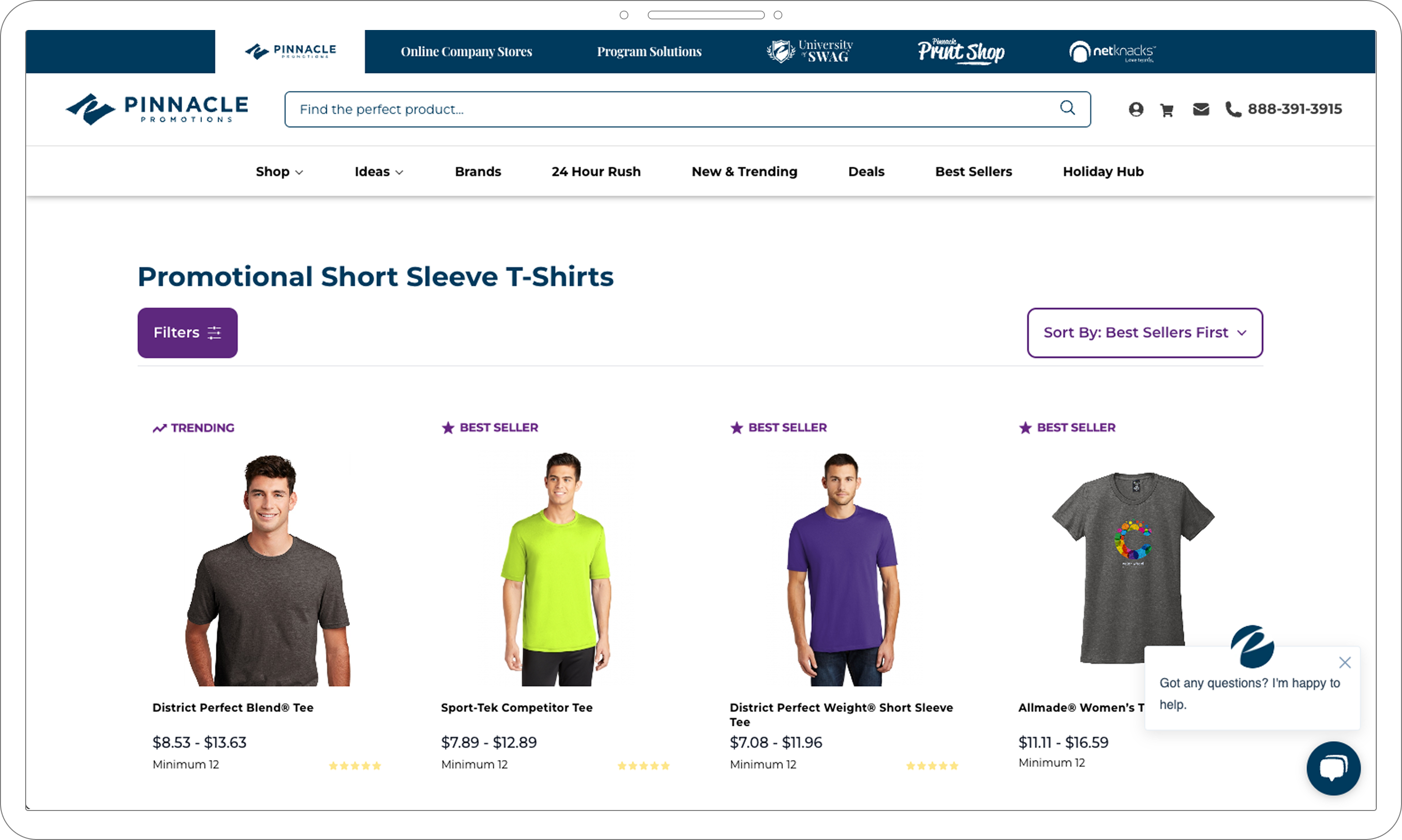
We believed that making the “Filter” and “Sort by” functions more visually prominent on product listing pages will help visitors find products more efficiently and increase lead generation.

Motivation:

A competitive audit revealed that best-in-class ecommerce sites highlight filtering tools more effectively.

At the time, Pinnacle’s filters were subtle, especially on desktop—appearing as small inline text links with minimal visual affordance.

What we changed

  • Replaced inline text with button-style UI for both Filter and Sort
  • Added a filter icon to improve affordance and visual clarity
  • Designed the change to match the site's visual language while standing out enough to guide behavior
Desktop Control
Desktop Variant
Mobile Control
Mobile Variant

Results

  • Visitors were 38% more likely to open the filter menu when the design was updated with button styling and icons.
  • Visitors were 25.8% more likely to view filtered product results, indicating deeper engagement and better browsing efficiency.
  • Desktop users showed stronger gains, with 5.3% viewing filter results compared to 3.5% on mobile—suggesting filtering is especially valuable when product overload is higher.
  • Overall, the improved UI led to an estimated $438,400 in additional annual revenue.
  • Insights: Why It Worked

  • Visual prominence matters: users noticed and interacted with the filters more when they looked like buttons.
  • Visitors found more relevant products faster, increasing conversions via web orders and virtual sample requests.
  • Desktop users appeared more overwhelmed by product choice and thus benefited more from the improved filtering tools.
  • Segment Insights

  • Desktop users were 5.3% more likely (vs 3.5% mobile) to view filtered results which suggests stronger need for filtering in large product grids.
  • What We Learned

  • UI affordance is essential in large product catalogs where clear filters reduce cognitive load.
  • Filtering tools should be designed for high visibility and intuitive use, especially on desktop.
  • Inspired future tests including filter reorganization (e.g., by popularity) and improving visibility of other key CTAs across the site.
  • Next Case Study